Ryze Superfoods Mushroom Coffee
Conceptual E-Commerce Redesign
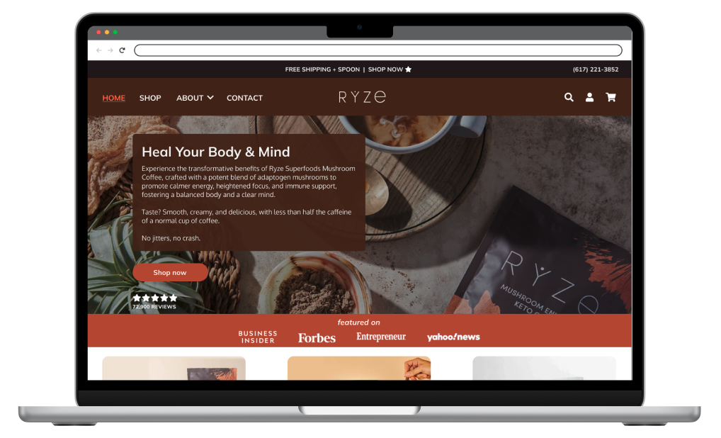
TYPE: Course Project → Extended Case Study
TIMELINE: 5 months (Oct 2023 - Mar 2024)
ROLE: Solo Designer - Research, UX, UI Design, Visual Design
Tools Used:


PROJECT OVERVIEW
This project began as a course assignment for my e-commerce design class and evolved into an extended learning opportunity. After discovering Ryze Superfoods through Instagram, I was intrigued by their product but noticed several UX opportunities on their website that could be limiting conversions.
Just as the course ended, so did Adobe XD - they discontinued their product, so I decided it was time to teach myself Figma, the industry-standard design tool. I rebuilt the entire project from scratch, transforming my initial wireframes into polished, high-fidelity mockups while learning Figma's component system, auto-layout, and variants. This resulted in a scalable design system with reusable components that made future updates more efficient.
Project Goals:
Apply end-to-end e-commerce UX methodology from research through high-fidelity design
Teach myself Figma's component system and design library functionality
Practice conversion optimization principles to reduce friction in the purchase journey
Develop a scalable design system demonstrating professional-level craft

THE CHALLENGE
Through initial analysis of Ryze Superfoods' website, I identified several usability issues that could be limiting conversions and contributing to their bounce rate.

of visitors to Ryze Superfoods e-commerce website leave after viewing just one page, indicating a high bounce rate.”
(Semrush, 2023)

Heuristic evaluation revealed key usability issues affecting the homepage experience
Key Usability Issues Identified:
Hidden navigation - Hamburger menu reducing product discoverability and requiring extra clicks
Unclear CTAs - Vague "TRY IT" hero messaging leaving users uncertain about next steps
Low trust signals - Credibility elements like media features buried below the fold
Poor product visibility - Unclear what's available to purchase on the homepage
These friction points likely contribute to the 51% bounce rate, cart abandonment, and missed sales opportunities in a competitive functional beverage market.
RESEARCH & INSIGHTS
To validate these observations and understand the competitive landscape, I conducted systematic research combining multiple methods:
Heuristic Evaluation
I audited the site using Jakob Nielsen's Usability Heuristics, identifying specific violations:
Visibility issues: Hamburger menu hid all main navigation
Recognition vs. recall problems: Users had to remember where things were rather than see them
Lack of clear feedback: CTAs didn't clearly communicate their destination
Trust building gaps: Security and credibility signals weren't prominent
Competitive Analysis

I analyzed direct competitors to benchmark Ryze's experience:
Navigation & Product Discovery:
Both competitors used visible navigation menus (vs. Ryze's hamburger menu) with clear "Shop" dropdowns.
Four Sigmatic displayed products above the fold; Laird organized products in intuitive categories. Ryze's ambiguous "Try Now" CTA and hidden product pages created unnecessary friction.
Visual Design & Accessibility:
Laird Superfood demonstrated strong contrast and readability.
Four Sigmatic had appealing design but some accessibility gaps. Ryze needed improved contrast between CTAs and backgrounds to reduce user errors.
Key Insight:
Both competitors prioritized visible navigation and clear product displays. Research shows hidden hamburger menus “hurt conversion rates because users will be less likely to navigate the site” (Nielsen Norman Group). My redesign addresses these gaps through persistent navigation, clearer CTAs, and improved product visibility.
SWOT Analysis
I conducted a SWOT analysis to understand Ryze's market position and identify strategic opportunities:

Strengths:
Strong brand reputation with excellent reviews
Effective social media marketing
Eco-friendly packaging
Commitment to health with ethically sourced organic ingredients
Opportunities:
Customer education about mushroom benefits
Product innovation and line expansion
Sustainability
Storytelling
Subscription model optimization
Reaching new audiences (cafes, fitness enthusiasts, plant-based consumers)
Weaknesses:
Website usability issues Limited product variety
High pricing Narrow distribution channels (online-only, no retail presence)
Limited customer service options (no phone contact)
Threats:
Growing market saturation (global mushroom coffee market expected to reach $4.12B by 2030)
Taste barriers limiting mainstream appeal
Supply chain vulnerabilities
Established competitors with larger distribution networks and product lines
Key Insights:
The SWOT revealed that while Ryze has strong brand equity through social media, their website usability weakness was limiting conversion potential. My redesign addresses this gap by improving navigation, product discoverability, and checkout efficiency - leveraging their strengths while mitigating a critical weakness.
UNDERSTANDING THE USER
To make sure my design decisions were grounded in real user needs, I created a buyer persona and customer journey map to represent Ryze's target audience and their path from discovery to purchase.
Buyer Persona
Based on analysis of Ryze's target audience through social media engagement, product reviews, and brand positioning, I developed a persona representing their core customer:

Meet Estella: Health-Conscious Coffee Nerd
Estella is a 34-year-old UX Designer in Portland who balances her career with teaching yoga, creating wellness content, and exploring trails with her dog Max. She's invested in holistic health and seeks products that align with her wellness goals.
Purchase Barriers:
Effectiveness: Will it actually deliver health benefits?
Trust: Is this a legitimate, ethical company?
Taste: Will mushroom coffee be palatable?
Context: Estella has maintained a monthly subscription with Ryze for the past year, indicating the product meets her ongoing wellness needs.
Design Implications: Understanding Estella's barriers helped me prioritize ingredient transparency, prominent trust signals, authentic user reviews (to address taste concerns), and subscription management features. Her goals informed decisions around social sharing capabilities and content that supports her wellness-focused lifestyle.
Customer Journey Map

I mapped Estella's journey from initial discovery through purchase, identifying emotional shifts and friction points across a 7-day timeline:
Days 1-2 (Awareness):
Estella discovers Ryze through Instagram ads and wellness influencer posts, feeling curious and excited about the unique mushroom blend.
Days 3-4 (Research):
As she explores the website, initial excitement turns to uncertainty. Missing nutrition details, mixed reviews, and difficult navigation create hesitation.
Days 5-6 (Comparison):
Anxiety peaks as she compares competitors. Lack of expert reviews, taste concerns, and price sensitivity make her feel overwhelmed.
Day 7 (Purchase):
Despite frustration with poor UX and missing trust signals, hope and excitement ultimately drive her to complete the purchase.
Critical Friction Points Identified:
Navigation confusion making product discovery difficult
Missing trust signals causing hesitation at decision moments
Lack of customer support options (no live chat or phone number) when questions arise
Insufficient credibility markers (no expert reviews or detailed nutritionals)
Design Priorities:
This journey map revealed that friction was highest during the transition from homepage to product pages and at the final purchase decision. These moments became my primary design focus - improving navigation clarity, adding prominent trust signals, and streamlining the checkout process to reduce drop-off at critical conversion points.
THE SOLUTION
My redesign focused on eliminating friction at the critical moments identified in Estella's journey - particularly during homepage navigation and the purchase decision.
Homepage Redesign
Before
After
Navigation Visibility
Before

After

The Problem: Hamburger menu hid all main links, making product discovery difficult and requiring extra clicks - a key friction point in Estella's research phase.
The Solution: Implemented persistent main navigation with clear links (Home, Shop, About, Contact). Research shows visible navigation can increase page views by 20-30% compared to hidden menus
Why It Matters: Nielsen Norman Group research confirms that "hamburger menus hurt conversion rates because users will be less likely to navigate the site." By making navigation always visible, I reduced cognitive load and made product discovery effortless.
Call-to-Action Clarity
Before

After

The Problem: Vague "TRY IT" button left users like Estella uncertain about next steps, creating unnecessary hesitation during the critical awareness-to-research transition
The Solution: Updated to "Shop Now" with clear, action-oriented language that sets expectations about the destination.
Why It Matters: Estella's journey showed uncertainty emerging when website experience didn't match expectations. Direct CTAs reduce cognitive load and build confidence by clearly communicating what happens next.
Trust Signal Placement
Before

After

Before
After
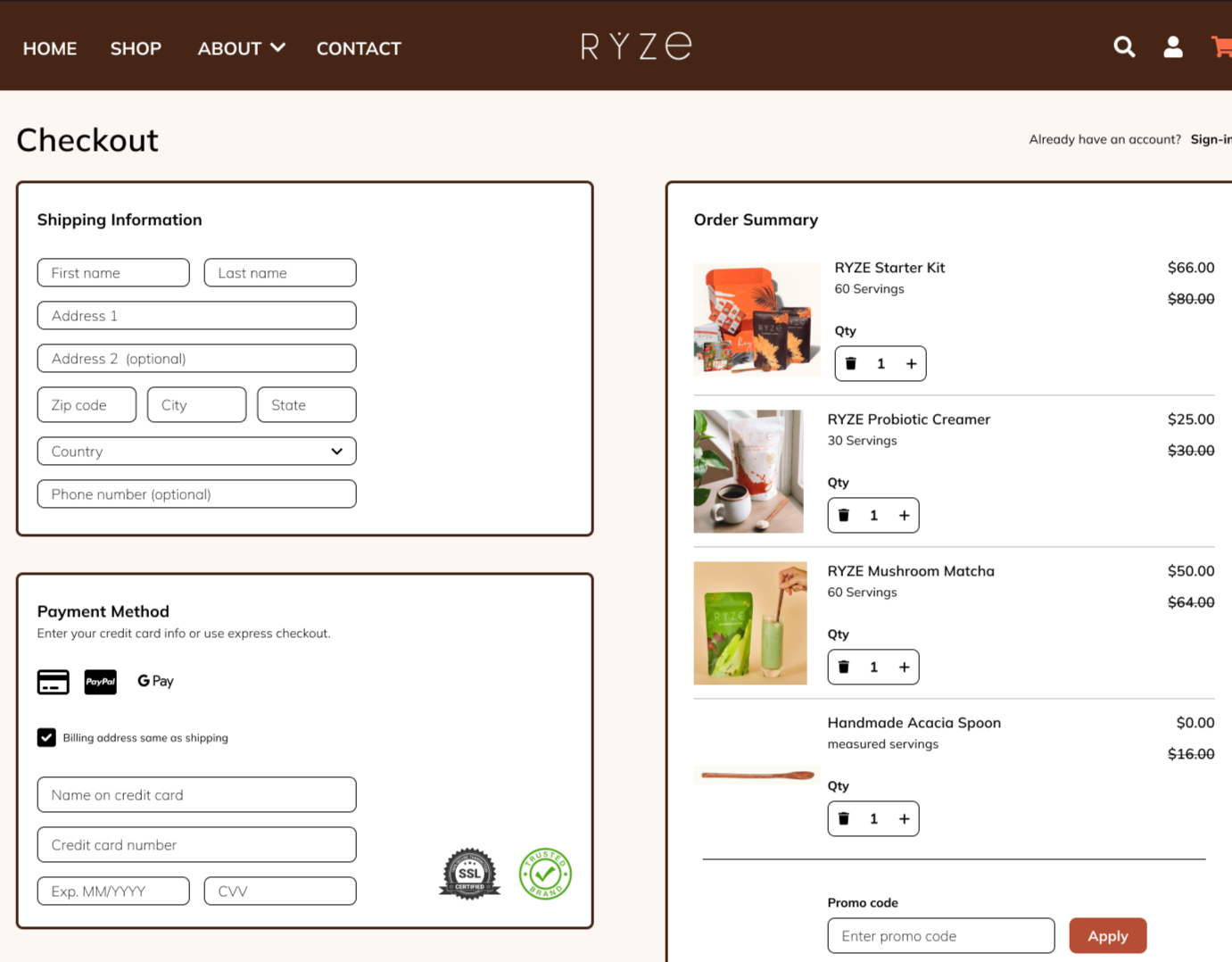
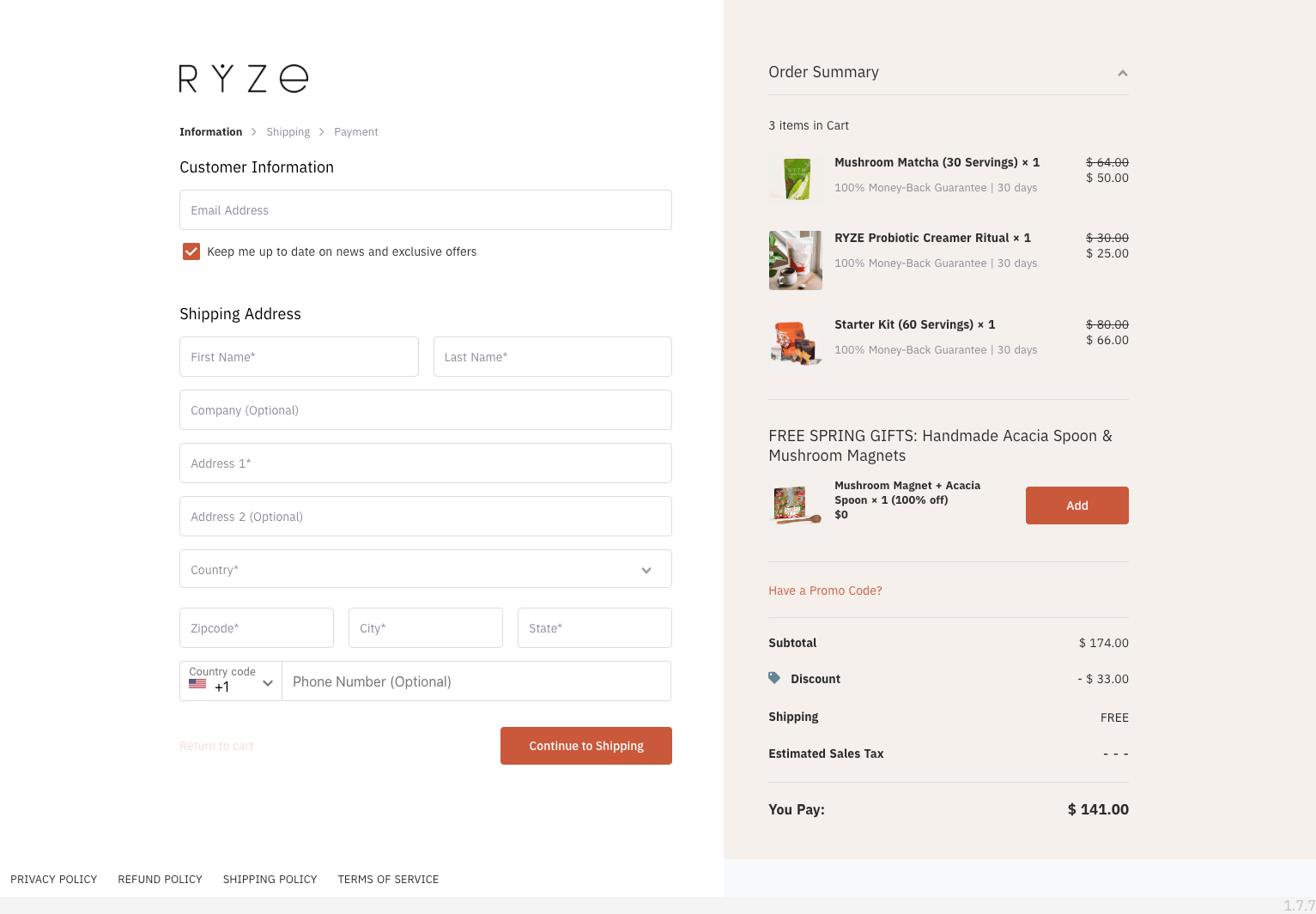
The Problem: Media mentions (Forbes, Men's Health) were below the fold, missing the opportunity to address Estella's trust barrier during her initial site visit. Additionally, security badges and payment icons were absent from the purchase flow, leaving users uncertain about payment safety at critical decision moments.
The Solution: Moved "Featured On" section above the fold for immediate visibility. Added security badges (SSL, secure checkout) and trusted payment icons (Visa, Mastercard, PayPal) throughout the purchase flow. Streamlined checkout from 5 steps to 3 by combining shipping, payment, and order summary on a single page.
Why It Matters: Baymard Institute research shows displaying trust signals early can increase conversions by 12-15%. Since brand trustworthiness was one of Estella's primary barriers, credibility markers needed to be prominent from the first impression.
Product Visibility
Before

After

The Problem: Homepage lacked clear product display, forcing users to search for what's available - directly contributing to navigation confusion identified in Estella's journey.
The Solution: MovedAdded three-column product showcase with high-quality images, clear descriptions, pricing, and "Add to Cart" CTAs immediately visible above the fold.
Why It Matters: E-commerce sites must answer "What can I buy here?" within seconds. The three-column layout gives immediate product understanding while addressing Estella's effectiveness barrier by showcasing health benefits upfront. Including customer ratings directly tackles her taste concerns with social proof.
DESIGN PROCESS
Approach
My process focused on systematic problem-solving: identify friction through research, design solutions aligned with user barriers, iterate efficiently, and build for scalability.
Initially, I created medium-fidelity wireframes in Adobe XD during my course. When Adobe discontinued XD, I saw an opportunity to learn Figma- the industry standard. I rebuilt the entire project from scratch, which deepened my understanding of each design decision rather than simply recreating existing work.
Building a comprehensive component library became the foundation, ensuring consistency while making iterations efficient -critical for testing solutions to Estella's friction points.
Sketches
Mobile View

Desktop View
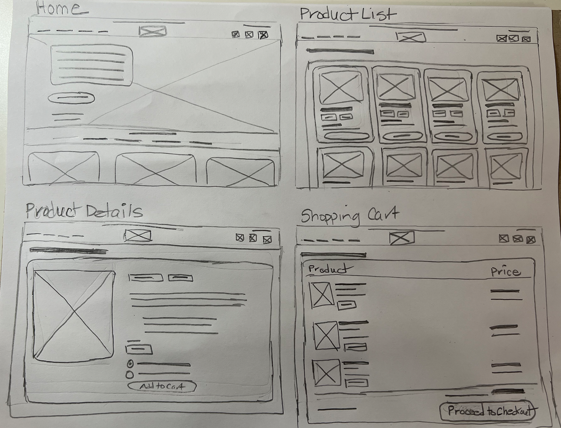
I started with rough sketches to explore layout options and information hierarchy for both mobile and desktop, testing multiple approaches quickly without detailed design commitment.
Key decisions explored:
Navigation placement (addressing Estella's discovery confusion)
Trust signal positioning (tackling her brand skepticism)
Product card layouts and information hierarchy
Mobile navigation patterns optimized for thumb-friendly interaction
Wireframes
Home

Checkout

Shopping Cart

Review Order
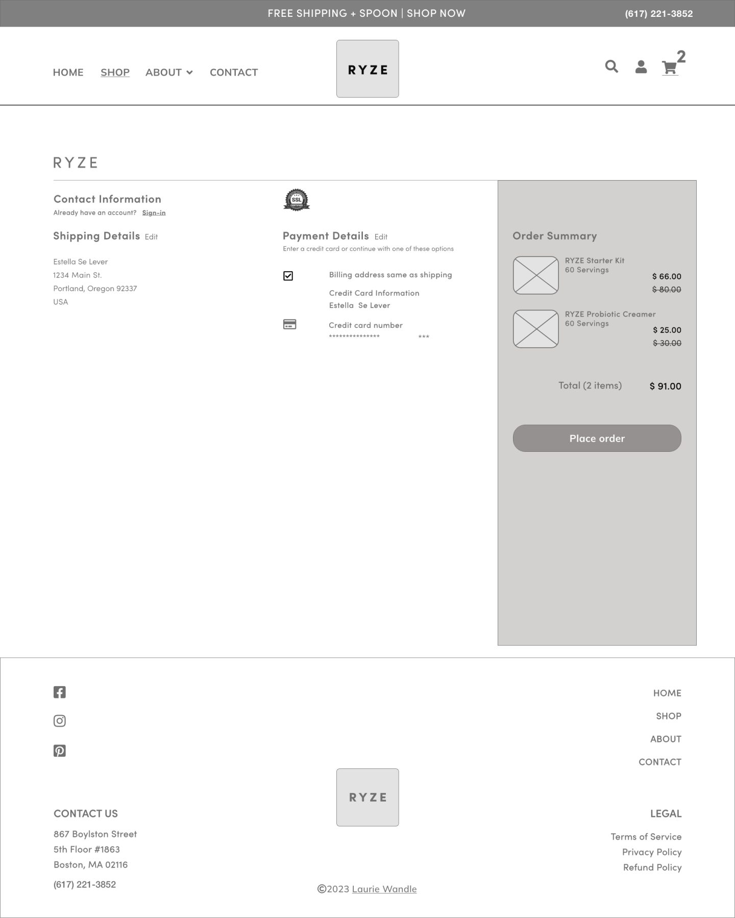
Created medium-fidelity wireframes in Adobe XD to establish structure and user flow before visual design. This allowed focus on functionality and hierarchy without distraction from colors or imagery.
Wireframe Focus Areas:
Homepage information architecture prioritizing trust signals and product visibility
Complete purchase flow from product selection to confirmation
Strategic placement of credibility markers at decision points
Form field organization and progressive disclosure in checkout
Mobile-responsive layouts for all key screens
The wireframes served as a blueprint when rebuilding in Figma, maintaining consistent structure while elevating visual design.

After teaching myself Figma, I developed a component library focused on core UI elements that appear across multiple screens:
Core Components Built:
Navigation: Header with main menu, mobile navigation, footer
Buttons: Primary CTAs, secondary buttons with hover/active states
Form Elements: Text inputs, radio buttons, checkboxes
Branding: Logo variations, navigation icons
Layout Components: Hero/section containers for consistent spacing
Component System Benefits:
Maintained visual consistency across all screens
Made iterations faster - updating one component updated all instances automatically
Reduced repetitive work by reusing elements like buttons, forms, and navigation
Provided hands-on experience with component-based design thinking
This approach showed me the value of designing with systems in mind, not just isolated screens. Even a smaller, focused component library makes a big difference in staying consistent and working faster.
Component Library
FINAL DESIGNS
The redesigned homepage and purchase flow create a more intuitive shopping experience that directly addresses Estella's barriers. Products and CTAs are prominent (reducing discovery friction), trust-building features like media mentions and security badges build confidence (addressing trustworthiness concerns), and navigation is simplified (eliminating confusion). Together, these updates tackle the core usability issues and user barriers identified in research.
Desktop Experience

Homepage: Clear navigation, prominent product showcase above fold, trust signals immediately visible, customer reviews addressing taste concerns
Products Page: Filterable product grid with clear pricing, ingredient transparency, subscription options, detailed nutritional information
Homepage

Products Page

Review Order
Shopping Cart


Share Modal

Product Details

Checkout
Order Confirmation
Mobile Experience

Home
Checkout

Products

Review Order

Product Details

Order Confirmation

Shopping Cart

Share
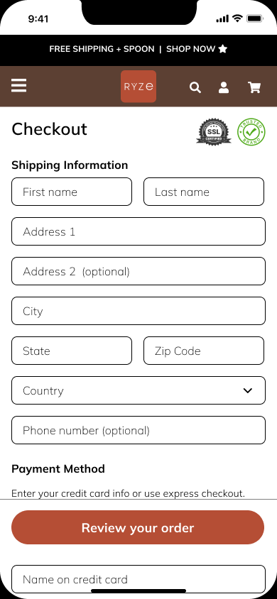
Optimized for mobile-first users with thumb-friendly navigation, simplified forms, and streamlined single-page checkout. Trust signals and security badges appear at critical decision moments (checkout and order review). All improvements maintain effectiveness on smaller screens where Estella likely browses during yoga breaks or trail walks.
Products Detail Page: Clear product information (serving size, weight, recyclable packaging), quantity picker with auto-ship option for convenience, prominent "Add to Cart" CTA
Shopping Cart: Clear order summary with savings callouts, easy quantity editing, security badges
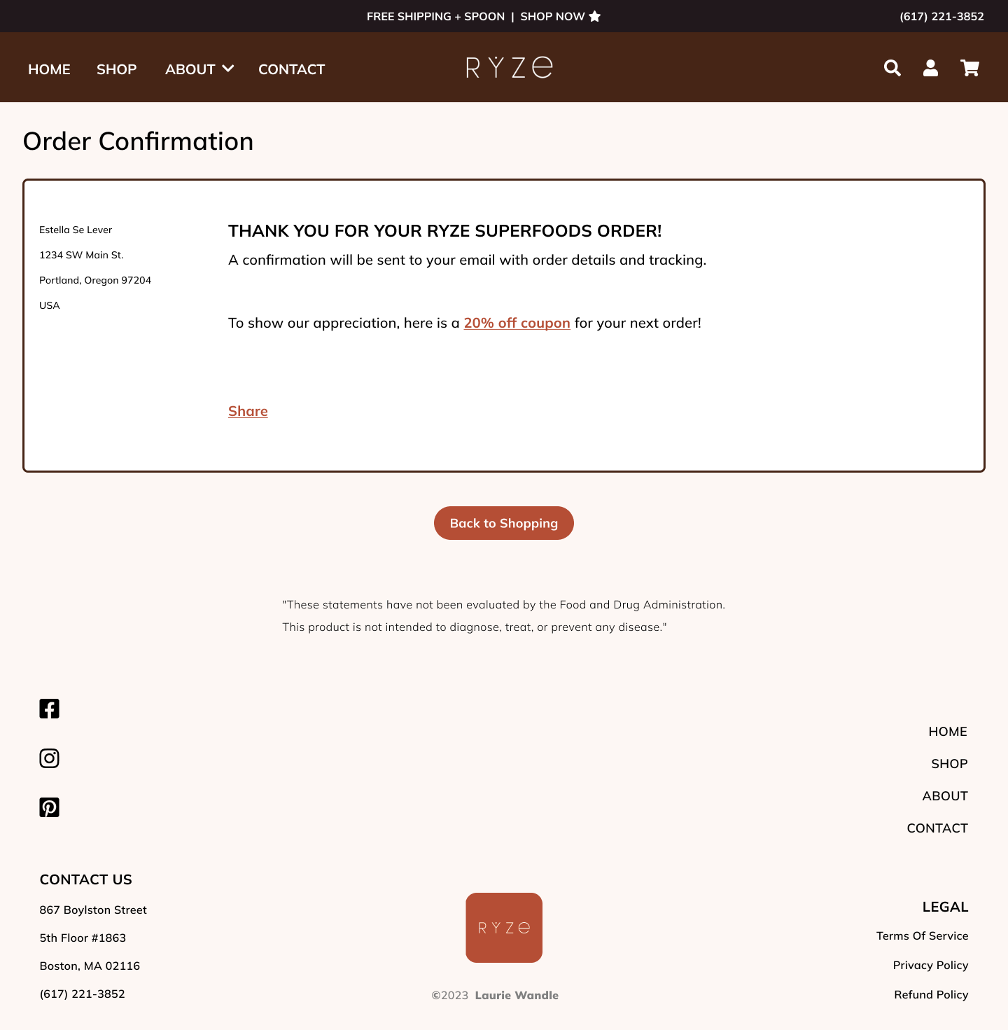
Order Confirmation: Personalized confirmation with customer name, complete order details (shipping address, payment method), reassurance messaging about email confirmation with tracking, appreciation message with 20% off coupon for next order, social sharing CTA
Share Modal: Overlay prompting users to share with friends via Facebook, Instagram, and Pinterest, plus "Copy Link" option with URL for easy sharing across other platforms
Checkout: Streamlined single-page checkout with shipping form, payment method with security badges, live order summary showing product images and pricing (one-time and auto-ship), promo code field, option to edit cart quantities
Review Order: Final confirmation screen displaying shipping details and payment method with security badges, order summary breakdown with last chance to apply promo codes, prominent "Place Your Order" CTA
RESULTS & LEARNINGS
Project Outcomes
What began as a course assignment evolved into a comprehensive UX case study demonstrating professional-level research and design execution:
Design Deliverables:
Complete homepage and 7-screen purchase flow for desktop and mobile
Figma component library with reusable UI elements
Responsive layouts optimized for multiple screen sizes
Documented design decisions connecting user research to solutions
Skills Developed:
Taught myself Figma's components, variants, and auto-layout from scratch
Applied e-commerce UX patterns: trust signals, progressive disclosure, friction reduction
Translated competitive analysis and user research into specific design decisions
Built a focused component system demonstrating systematic design thinking
Hypothesized Impact
Based on e-commerce benchmarks and UX best practices, these changes could potentially:
Reduce bounce rate 10-15% (from 51% to ~43-46%) through visible navigation and immediate product showcase
Increase product page views 25-30% by making products discoverable from the homepage
Improve checkout completion 15-20% by streamlining from 5 steps to 3 and adding strategic trust signals
Address key user barriers: Trust (credibility markers), effectiveness (ingredient transparency), taste (customer reviews)
Note: These are projections based on industry research and would require A/B testing to validate.
Key Takeways
What Worked:
Starting with persona and journey map made every design decision defensible
Competitive analysis provided clear benchmarks
Building even a focused component library significantly improved efficiency and consistency
Teaching myself Figma through hands-on work was more valuable than tutorials
What I'd Do Differently:
Conduct quick usability tests on wireframes with 5-8 users before high-fidelity design
Add accessibility considerations earlier (WCAG contrast, alt text)
Test multiple navigation approaches to compare trade-offs
Add review functionality to Product Details page for stronger social proof
Biggest Lesson:
E-commerce design requires balancing business goals with user needs. Every decision should serve both - like how prominent product display increases sales opportunities while helping users like Estella quickly understand what's available and whether it meets her wellness goals. Even small UX improvements at critical friction points can significantly impact conversion.
Recommended Next Steps
Validate: Usability testing with 8-10 target users
Measure: A/B test navigation and trust signal placement
Track: Implement analytics on key interactions (navigation clicks, checkout progression)
Iterate: Refine based on data, particularly around mobile checkout flow
Accessibility: Ensure WCAG AA compliance across all touch points

