

Drops Candies
Website UX Redesign

TYPE: Client Project
TIMELINE: 2 weeks (August 2025)
ROLE: UX Designer - Accessibility Audit, Information Architecture, Design Systems, Prototyping
Tools Used:


PROJECT OVERVIEW
Drops Candies, a premium cannabis edibles brand based out of Portland, Oregon, engaged me as a UX designer to improve their website's user experience. The goal was to identify friction points affecting usability and redesign key pages to create a more user-friendly shopping experience.
For two weeks, I conducted accessibility audits, analyzed navigation patterns using a card sorting exercise, redesigned the homepage and category page, created a component library with variants in Figma, and delivered a high-fidelity interactive prototype demonstrating the proposed UX improvements.
Project Goals:
Improve accessibility compliance by testing logo and color palette against WCAG standards
Streamline navigation using card sorting exercise and information architecture principles
Optimize the homepage to drive product discovery and reduce decision-making friction
Build a component library with variants for design consistency
Deliver a functional prototype demonstrating the redesigned experience
Before
After
THE CHALLENGE
During my initial analysis, I identified three areas that needed optimization on the Drops website:
1. Accessibility Issues
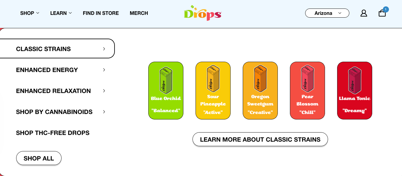
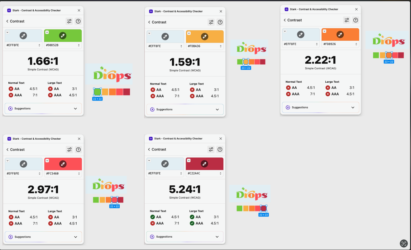
As shown, Drops Candies' logo and color palette didn't meet WCAG contrast standards. The accessibility audit on the right shows several color combinations falling short of the 4.5:1 ratio required for readable text, making it harder for users with color blindness or visual impairments to read the site. This is both a usability problem and a legal compliance risk.
2. Navigation
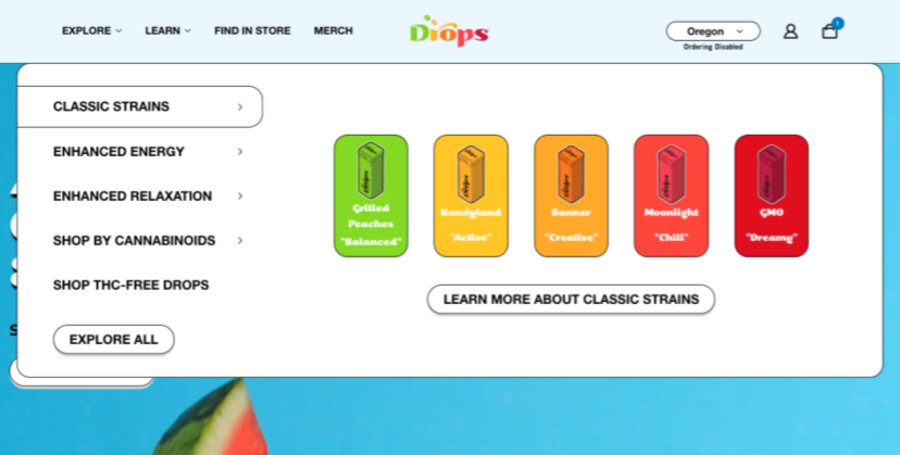
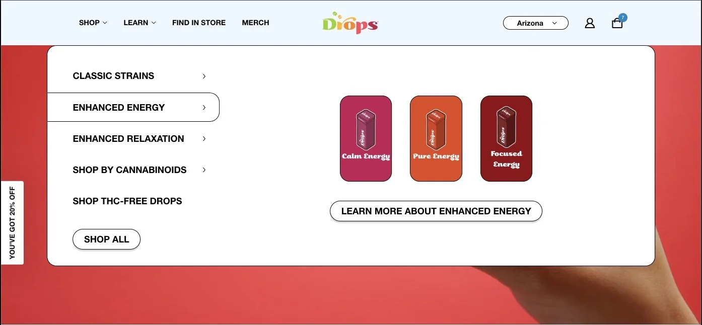
The dropdown menu had too many items and category images, which can overwhelm users. According to a psychology principle called Hick's Law - the more choices a person has to make means it will take them longer to make a decision - which creates friction that can slow down a customers' shopping experience.
3. Homepage
The featured product carousel had several issues:
Jumping Carousel: The carousel felt disruptive when users clicked between categories (Enhanced Energy, Classic Strains, Enhanced Relaxation), making product discovery difficult
Confusing CTAs: "Add to Cart" appeared in some states, "Learn More" in others, creating confusion about what action to take
Distracting Backgrounds: Bright product backgrounds drew attention away from the products themselves
RESEARCH & INSIGHTS
Understanding UX Impact
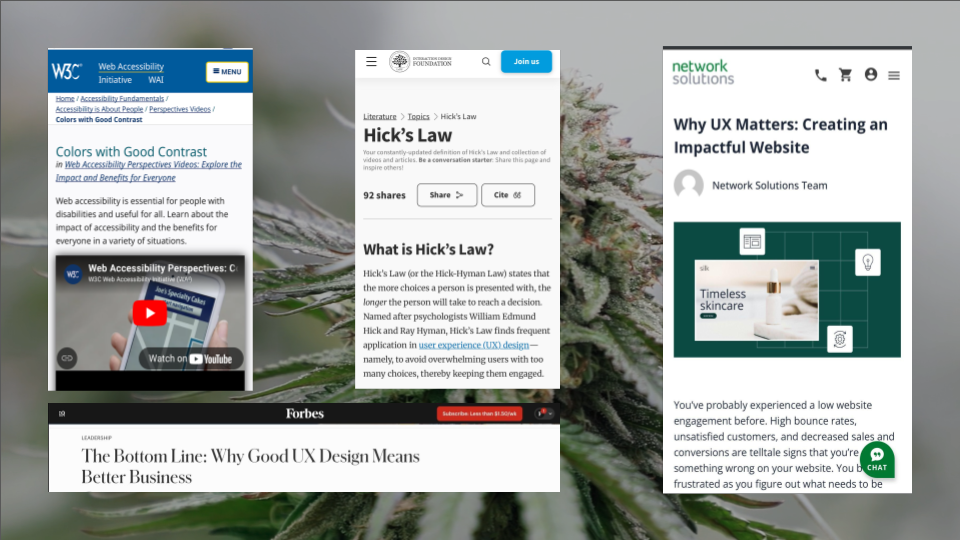
They weren’t familiar with User Experience, they heard about it but wanted to learn more so I researched articles from trusted UX sources like Nielsen Norman Group, WAI (Web Accessibility Initiative), and others to show the Drops team why UX is important. I wanted them to understand that my recommendations were backed by real research and industry best practices, not just my design opinion. This helped frame the entire project around solving real problems with proven solutions.
Accessibility: Testing & Solutions
I used the Stark Accessibility plugin in Figma to measure color contrast ratios and test different background options:
Testing Process:
Tested logo colors on current website background (light blue-gray): All colors failed except the cherry red “S”
Tested on black background: Improved significantly for most colors
Found that cherry red "S" had the lowest score but it was still slightly above standard
Stakeholder Feedback & Alternative Approach:
When stakeholders raised concerns about a black background I proposed for the main navigation, I worked through their feedback and adjusted the design, showing how design decisions can flex to address real business concerns while still solving the underlying UX problem.
Key Insight: Both redesigned approaches significantly improve accessibility compared to the original. The darker brand color option maintains the improvement while feeling more aligned with Drops' existing visual identity.
Navigation: Card Sorting Exercise
To understand how users naturally group content, I conducted a card sorting exercise:
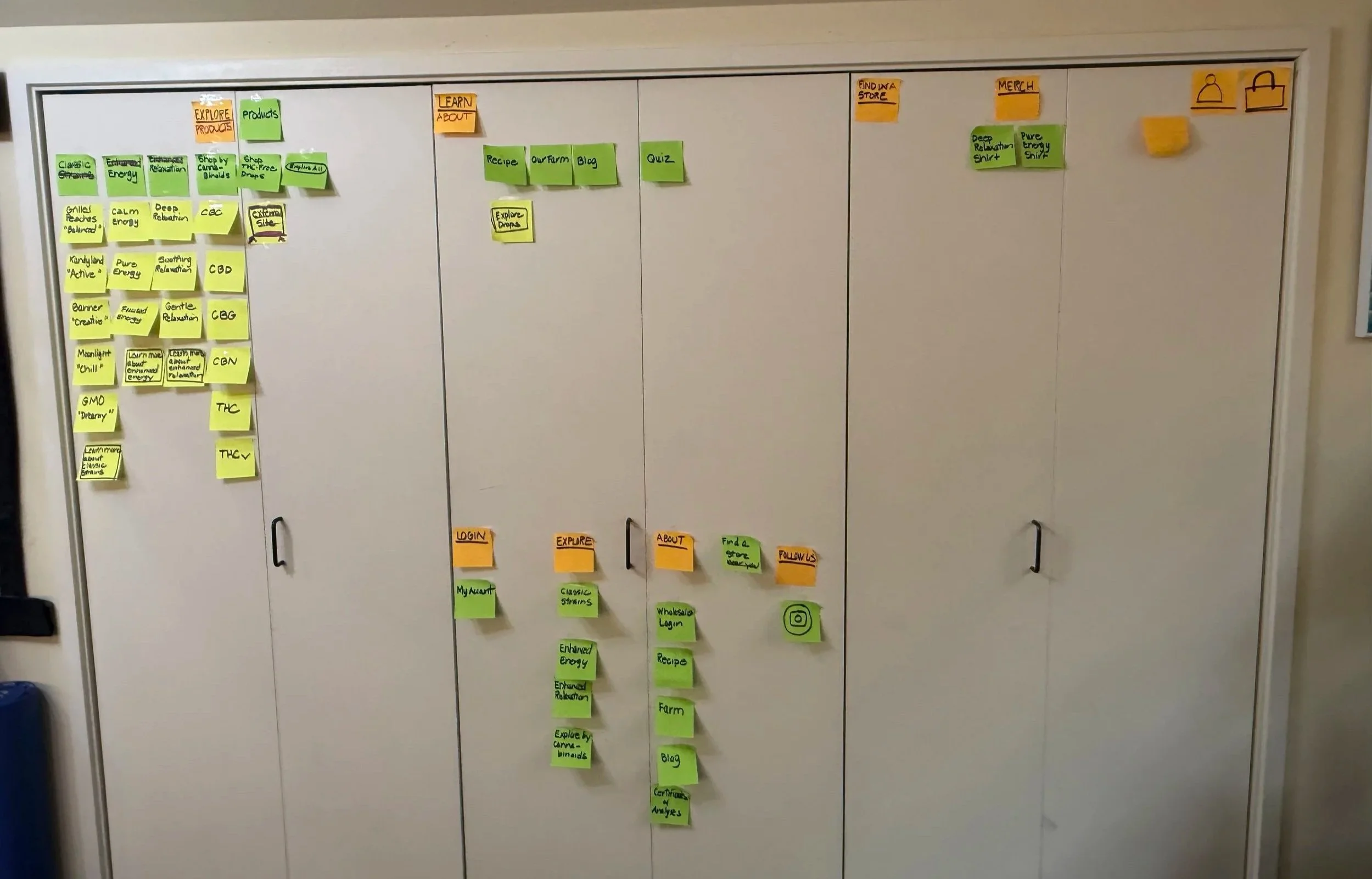
Based on these natural groupings, I identified three opportunities for improvement:
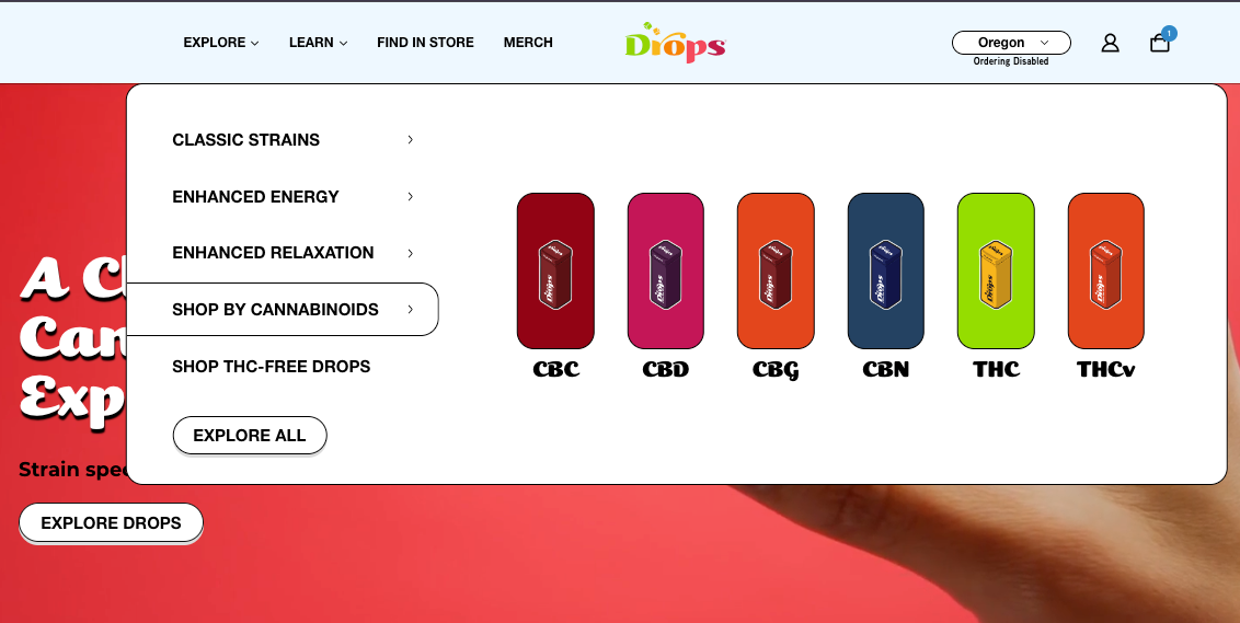
Redundancy: The “Shop by Cannabinoids” link in the navigation duplicated filtering functionality that was already available on the products page. Users could access cannabinoid filtering in two places, creating unnecessary menu items.
2. Label Clarity: Category names like “Enhanced Energy” and “Enhanced Relaxation” were longer than necessary and could be simplified.
3. Navigation Consistency: The main navigation switched between "Shop All" and "Explore All" labels depending on user state, creating inconsistency in how users accessed all products.
THE SOLUTION
My approach focused on three strategic areas: improving accessibility compliance, streamlining navigation, and optimizing the homepage experience.
1. Accessibility: Testing & Solutions
The Problem: The logo and color palette didn't meet WCAG (Web Content Accessibility Guidelines) contrast standards, creating barriers for users with color blindness or visual impairments and posing a legal compliance risk.
The Solution: Using the Stark Accessibility plugin, I tested different background options and determined that darkening the header background would significantly improve contrast while maintaining brand identity. Rather than redesign the logo itself, I recommended using Drops' darkest brand color with white logo and navigation text:
2. Navigation Redesign
The Problem: The dropdown menu had too many items and category images. According to the psychology principle, Hick's Law, the more options a user has the longer it takes for them to make a decision. This creates friction in the navigation experience and will likely slow the customer’s path to purchase.
Additionally, cannabinoid filtering appeared in both the navigation dropdown AND on product pages, creating redundant pathways and menu bloat.
The Solution: I applied the card sorting insights to streamline the navigation:
Before
After
Navigation Restructure:
Removed "Shop by Cannabinoids" from the main navigation - cannabinoid filtering remains available on Drop’s products page where users can use it while they’re browsing products. This reduces the navigation menu items without losing any functionality.
Simplified labels:
"Enhanced Energy" → "All Energy,"
"Enhanced Relaxation" → "All Relaxation"
Unified "All Products" as single navigation term (replacing inconsistent "Shop All"/"Explore All" across states)
Why It Matters: Clear navigation helps users find categories faster with fewer cognitive decisions. By reducing options and simplifying labels, I created a more intuitive path to products.
3. Homepage
The Problem: The featured product carousel had several issues working against product discovery. Clicking between categories (Enhanced Energy, Classic Strains, Enhanced Relaxation) caused the carousel to jump abruptly, disrupting the browsing experience. Call-to-action buttons were inconsistent, "Add to Cart" appeared in some states and "Learn More" in others, leaving users unsure what action to take. On top of that, bright, saturated product backgrounds competed with the products themselves for attention, making it harder to actually see what was being sold.
The Solution: I redesigned the homepage to simplify discovery and reduce visual noise:
Before
After
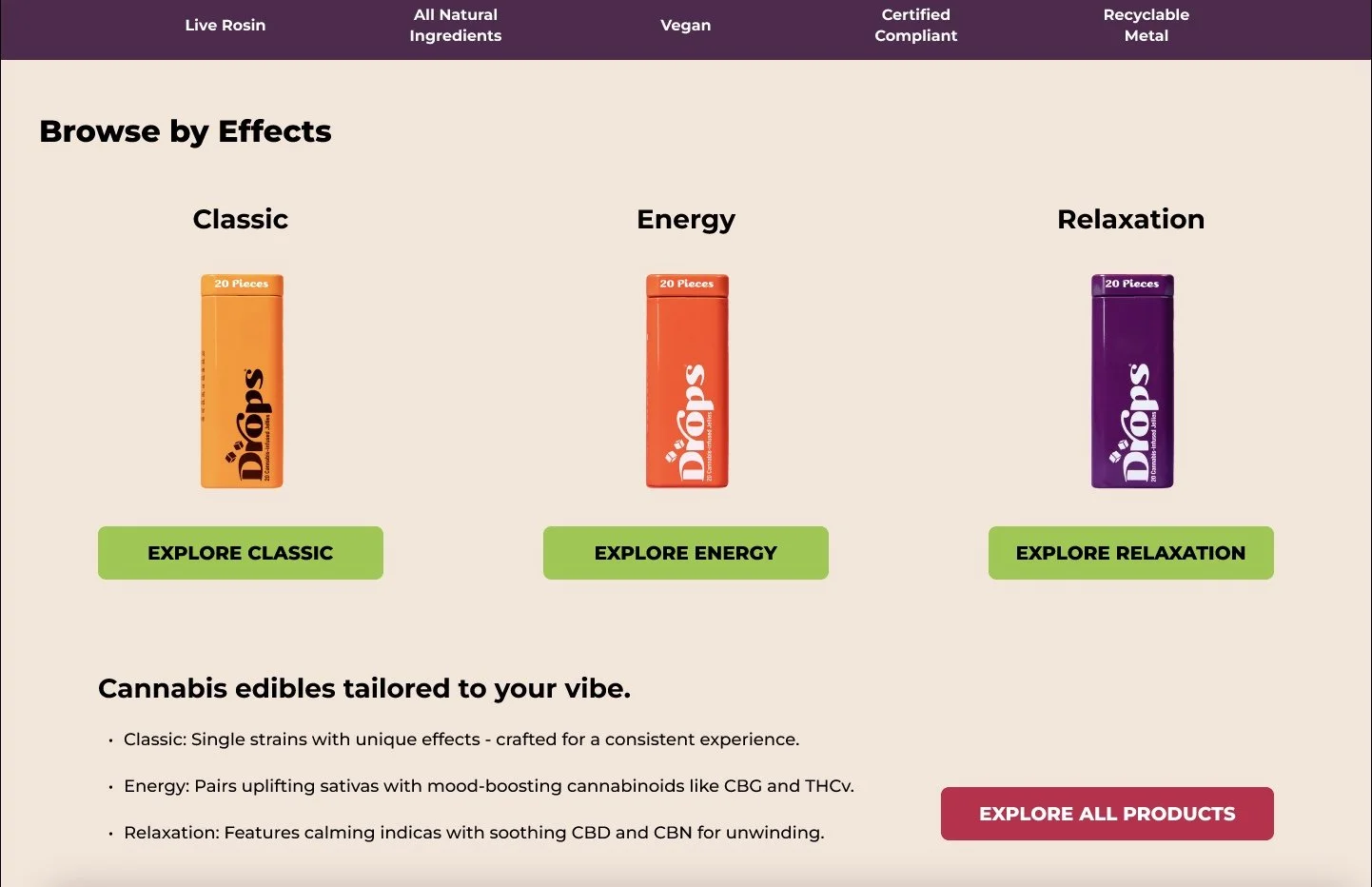
Added a Browse by Effects section alongside Featured Drops, giving users multiple paths to purchase rather than a single route through the homepage, a common e-commerce best practice that prevents dead ends and keeps different types of shoppers engaged. Together, they replace the single jumping carousel with two focused, static sections, aligning with research showing static content converts better than auto-rotating carousels, which users tend to ignore.
Why It Matters: A static, consistent layout builds trust. When information doesn't jump or shift unpredictably, users can take their time evaluating ingredients, dosage, and price without feeling rushed or confused, creating a calmer, more transparent shopping experience.
A Second Path to Purchase: Browse by Effects
This approach:
Improved visibility for most logo colors
Maintained brand identity (didn't change logo itself)
Made the logo easier to see and read
Met WCAG standards for accessibility
Why It Matters: Accessibility improvements ensure all users can navigate the site confidently while protecting the brand from legal compliance issues. By choosing an alternative that stayed closer to their existing color system, stakeholders felt the improvement aligned with their brand identity.
Homepage Improvements:
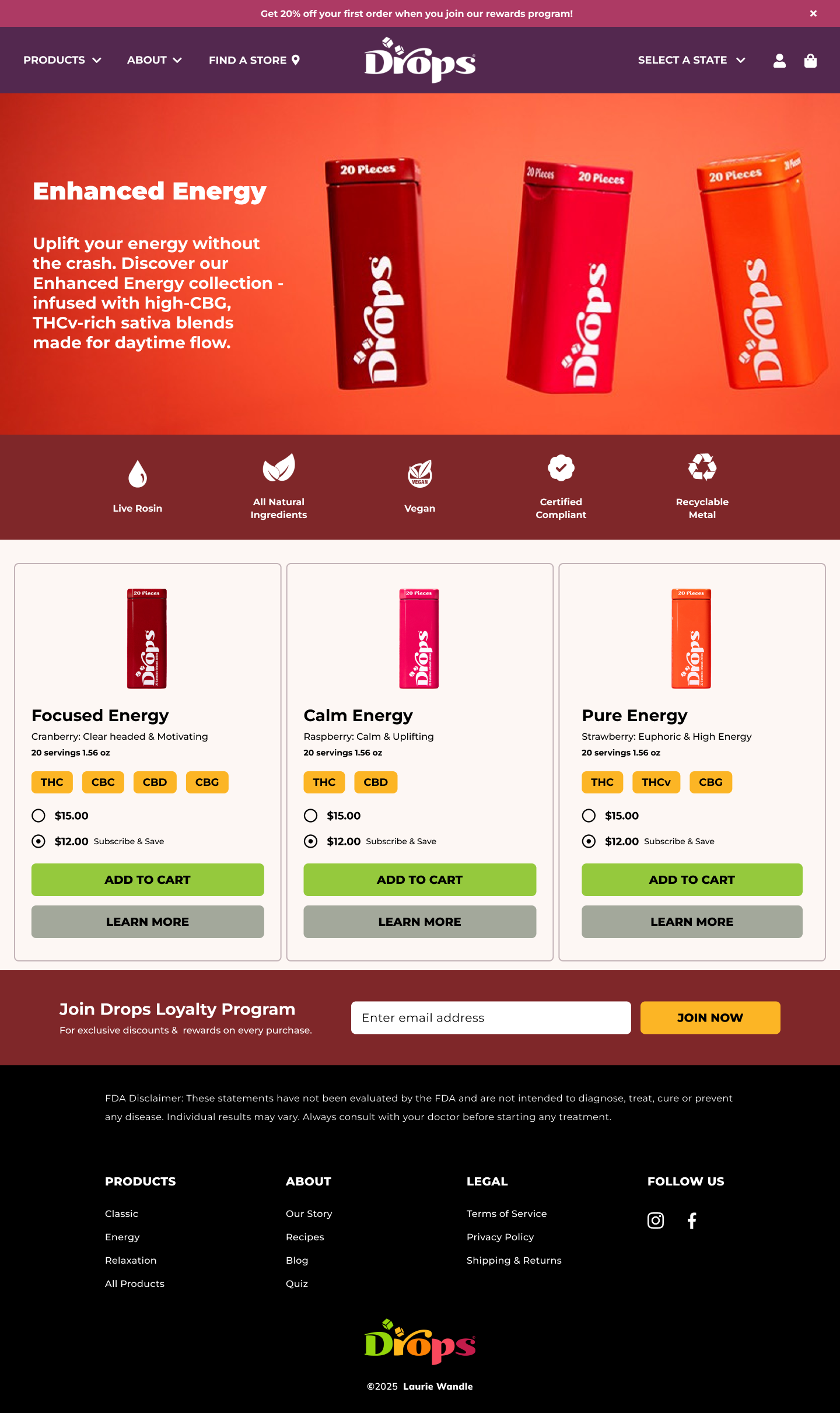
Replaced the moving carousel with a static Featured Drops grid, removing the disruptive category-jump entirely
Displayed cannabinoid content upfront as clear pill-shaped tags (THC, CBD, CBG, THCv, etc.), along with the exact amount per product, so users know exactly what they're getting before deciding
Added a short description to each product card explaining what it does, giving users context without needing to click through to a separate page
Surfaced subscription pricing directly on the card, showing users the discounted price alongside the standard one
RESULTS & LEARNINGS
Project Outcomes
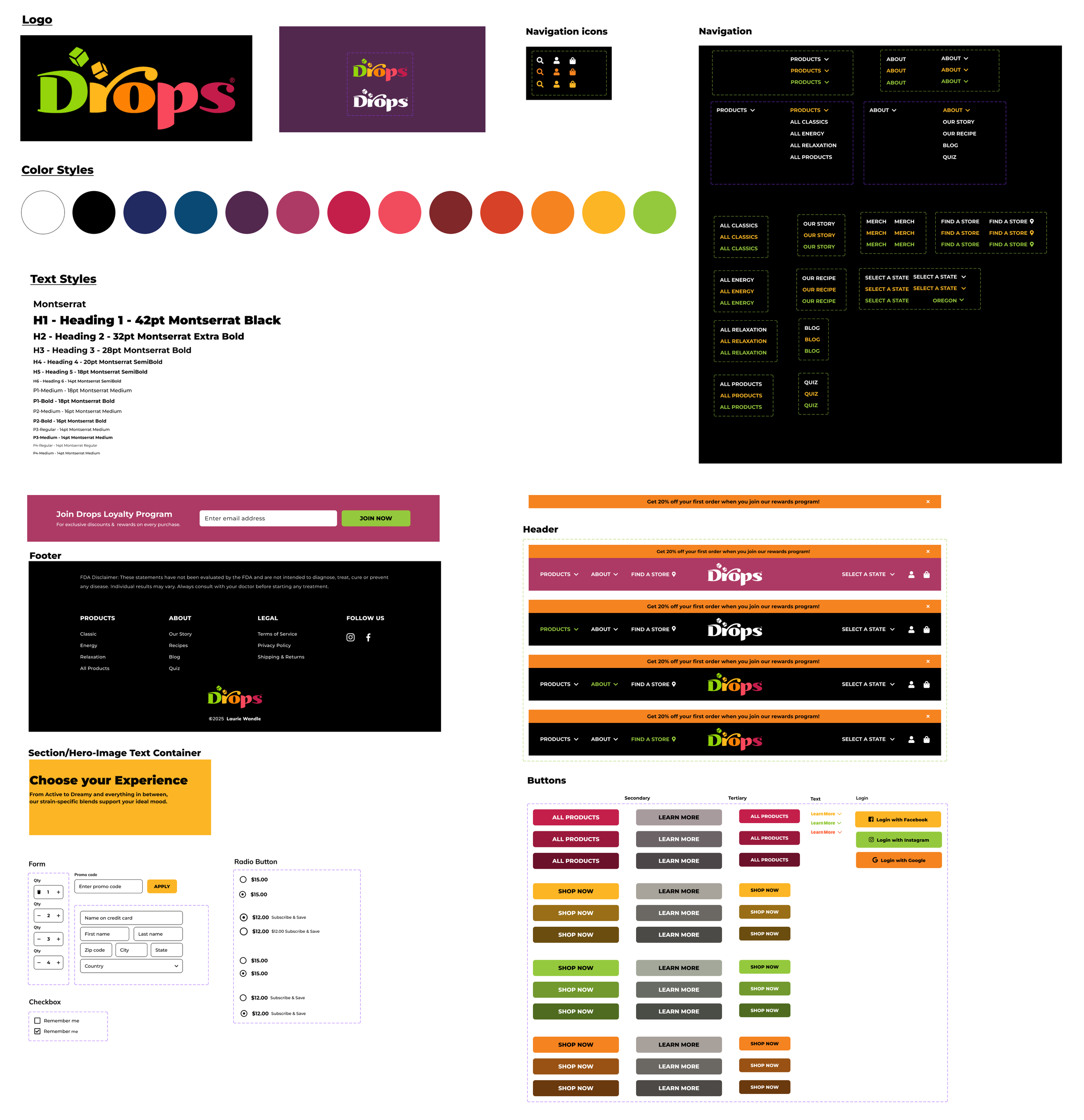
Over two weeks, I conducted accessibility audits, ran a card sorting exercise to inform navigation, redesigned the homepage and category pages, built a Figma component library, and delivered an interactive prototype demonstrating the improvements.
Design Deliverables:
Accessibility audit with tested contrast solutions
Streamlined navigation, reducing menu items by 40%
Static homepage layout replacing the disruptive carousel, with a Featured Products section (transparent pricing, subscription options) and an elevated Trust Bar
Consistent category pages with clear filtering
Figma component library with reusable UI elements for scalability
Hypothesized Impact
Based on e-commerce UX best practices, these changes could reduce navigation complexity, improve WCAG AA accessibility compliance, decrease decision-making friction, and increase trust through clearer hierarchy and credibility markers.
Note: These are projections based on UX best practices. Actual impact would require user testing and conversion tracking to validate.
Key Takeways
What Worked:
Card sorting exercise provided concrete insights into natural content grouping
Real-world research (dispensary visits) grounded design decisions in actual user behavior
Stakeholder collaboration showed willingness to iterate when concerns arose
Accessibility testing provided measurable data for decision-making
Focused component library ensured consistency and scalability
What I'd Do Differently:
Conduct quick usability tests with 5-8 users on navigation and layout variations
Add accessibility considerations earlier in the design process
Test state-dependent CTA solutions before finalizing navigation structure
Document the redundant cannabinoid filtering issue more thoroughly during research phase
Create a more detailed information architecture diagram during planning
Biggest Lesson:
Navigation and UX design isn’t just about aesthetics - it’s about reducing friction and respecting users' cognitive load. By removing redundant options, simplifying the labels, and applying psychology principles like Hick's Law to the redesign, I created a more intuitive and user-friendly experience. Sometimes adding features isn’t the answer - sometimes we have to simplify.
Recommended Next Steps
Validate: Usability testing with 8-10 users to measure navigation effectiveness and product discoverability
Measure: Implement analytics tracking navigation clicks, product page visits, and conversion rates
Test: A/B test layout variations (Featured Products above/below Browse by Effects and trust signal placement
Iterate: Refine based on user feedback and data
Accessibility: Ensure WCAG AA compliance across all pages and test with users
Develop: Design and implement the “Find Store” overlay solution for out-of-state users