

CASE STUDY
RYZE MUSHROOM COFFEE
E-Commerce Redesign & Design System
ROLE
UX Designer
TIMELINE
5 Months (Oct-Mar 2024)
CLIENT
Conceptual
TOOLS




Overview
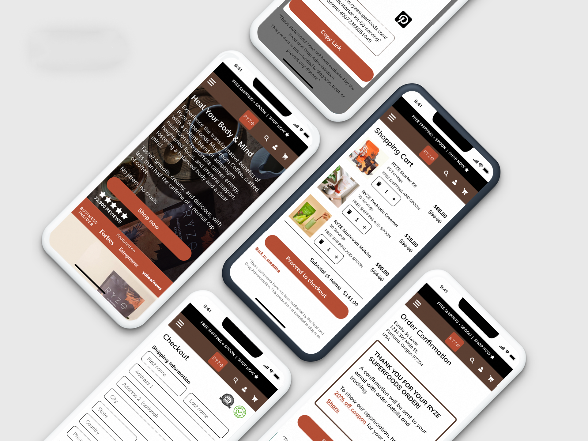
Ryze Superfoods is a conceptual e-commerce redesign where I applied end-to-end UX methodology from research through high-fidelity design. Over 5 months, I conducted comprehensive user research, created a customer persona and journey map, and redesigned both desktop and mobile experiences to improve product discoverability and streamline the purchase flow. I developed a scalable design system with reusable components in Figma that demonstrates scalable, production-ready design.
The Challenge
Hidden Navigation
Using a hamburger menu in desktop view reduces product discoverability and requires extra clicks to access categories.
Unclear CTAs
Based on UX principles, unclear messaging obscures the purchasing action and confuses users about next steps.
Poor Product Visibility
Users couldn't see product variety or options above the fold, limiting purchase opportunities.
Design Approach
For this conceptual project, I started by researching Ryze's market position and website usability. I conducted multiple research methods to identify UX opportunities, then created a customer persona and journey map based on what I discovered during my research.
I started with sketches to explore different layouts and information hierarchies, then created wireframes in Adobe XD to test out the structure and flow. Then I moved to Figma to design high-fidelity mockups and built a component library to keep everything consistent across desktop and mobile.
Research & Discovery
For this conceptual project, I used a research-first methodology. I conducted a heuristic evaluation, competitive analysis, and SWOT analysis to identify market and UX opportunities. Then I created a customer persona, Estella, and mapped her journey from discovery through purchase to identify pain points that would inform my design decisions.
Key Research Methods:
Heuristic evaluation (usability audit)
Competitive analysis
SWOT analysis
Customer persona (based on research)
Journey mapping (user experience analysis)
Key Findings:
Hidden navigation (hamburger menu) reduced product discoverability
Unclear CTAs left users uncertain about next steps
Trust signals buried below the fold decreased credibility
Poor product visibility made it unclear what was purchasable
Design Process
Customer Journey Map
Identified pain points across the purchase journey to guide design decisions. I mapped a user's 7-day journey from initial discovery through purchase, revealing emotional shifts and critical friction points:
Days 1-2 (Awareness): User discovers Ryze through social media, feeling curious and excited about the product.
Days 3-4 (Research): Excitement turns to uncertainty as missing nutrition details, mixed reviews, and difficult navigation create hesitation.
Days 5-6 (Comparison): Anxiety peaks comparing competitors. Lack of expert reviews and trust signals cause overwhelm.
Day 7 (Purchase): Despite frustration with UX and missing credibility markers, the user completes purchase.
Critical friction points identified: Navigation confusion, missing trust signals, lack of customer support options, insufficient credibility markers. These insights directly informed my redesign priorities, focusing on navigation clarity, prominent trust signals, and streamlined checkout.
Mid-Fidelity Wireframes
Explored layout solutions for homepage and mobile checkout in Adobe XD before moving to high-fidelity design. Wireframes focused on structure and user flow without visual distraction, establishing a blueprint for the final design.
Wireframe focus areas: Homepage information architecture prioritizing trust signals and product visibility. Complete purchase flow from product selection to confirmation. Strategic placement of credibility markers at decision points. Form field organization and progressive disclosure in checkout. Mobile-responsive layouts for all key screens.
This approach allowed me to test functionality and hierarchy first, then elevate visual design in Figma while maintaining consistent structure and user flow.
Component Library
Built a scalable design system in Figma to ensure consistency across desktop and mobile platforms. Core components included navigation, buttons, form elements, branding elements, and layout containers.
Component benefits: Maintained visual consistency across all screens. Made iterations faster by updating components globally. Reduced repetitive work by reusing elements like buttons, forms, and navigation. This hands-on experience showed me the value of designing with systems in mind, not just isolated screens.
Design Solutions
Homepage Redesign
Before
After
Redesigned the homepage to improve usability and guide users toward conversion:
Replaced the desktop hamburger menu with a prominent navigation menu to improve overall site navigation and streamline the path to purchase
Clarified hero CTA messaging from vague "TRY IT" to action-oriented language guiding users toward next steps
Moved trust signals (Forbes, media features) above the fold for immediate credibility
Introduced a featured product showcase above the fold with integrated quick add-to-cart buttons to optimize the purchase path and drive conversion
Added "JOIN THE RYZE CLUB" loyalty program banner early in the user journey to capture email signups and drive repeat customers
Removed the FAQ section to reduce homepage scroll and recommended moving it to a dedicated page under About navigation to improve information architecture and serve consideration-stage users
Mobile Purchase Flow
Before
After
Shopping Cart
Key Improvements:
Simplified cart display with clear product information and pricing transparency (sale price vs original)
Improved quantity controls with larger, clearer +/- buttons
Added promotional benefit messaging ("FREE SHIPPING AND SPOON") to highlight value
Single, prominent "Proceed to checkout" CTA eliminates decision fatigue
Subtotal displayed clearly at bottom
Before
After
Order Review
Key Improvements:
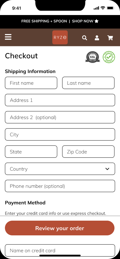
Added SSL and security badges prominently to build trust before payment
Expanded order summary by default for full transparency (no collapsing)
Organized into clear sections: Shipping Information, Payment Method, Order Summary
Included "Edit" options so users can modify shipping or payment info, reducing purchase anxiety
Clear pricing displaying original vs. sale price
Strong "Place your order" CTA signals final commitment
COMPLETE MOBILE PURCHASE FLOW: HOME TO SHARE
Home

Products

Product Details

Shopping Cart

Checkout
Review Order

Order Confirmation

Share

The flow guides users from product discovery to purchase to sharing, with clear CTAs and trust signals at each stage:
Home → User discovers product and clicks "Shop now" to explore offerings
Products → User browses product catalog clicks on image to view product details and/or “Add to cart”
Product Details→ User learns about product and/or can “Add to cart”
Shopping Cart → User reviews cart contents (3 products), sees pricing transparency, and clicks "Proceed to checkout"
Checkout → User enters Shipping Information and Payment Method with streamlined, mobile-optimized forms and prominent security badges
Review Order → User confirms shipping address and payment details with visible security badges reinforcing trust before final commitment
Order Confirmation → User receives thank you message celebrating the purchase and receives 20% loyalty discount for next order
Return → "Back to shopping" CTA incentivizes repeat purchases and continued browsing
Share → User encouraged to share purchase via social media (Facebook, Instagram, Pinterest) or copy shareable link
Outcomes & Impact
RESEARCH METHODS
5
Heuristic evaluation, competitive analysis, SWOT, customer persona, customer journey map
PURCHASE FLOW SCREENS
16
Optimized: 8 desktop, 8 mobile
DESIGN SYSTEM
20+
Components created
Key Takeaways
What I learned: I found that research-driven design decisions create better solutions. My heuristic evaluation, competitive analysis, customer persona. and customer journey map revealed specific friction points that directly informed my redesign choices.
Biggest lesson: I realized that understanding user behavior is essential to solving problems. When I grounded my design in research findings and user needs, every decision had a purpose, from simplifying Ryze’s navigation to adding trust signals to optimizing the purchase flow.